
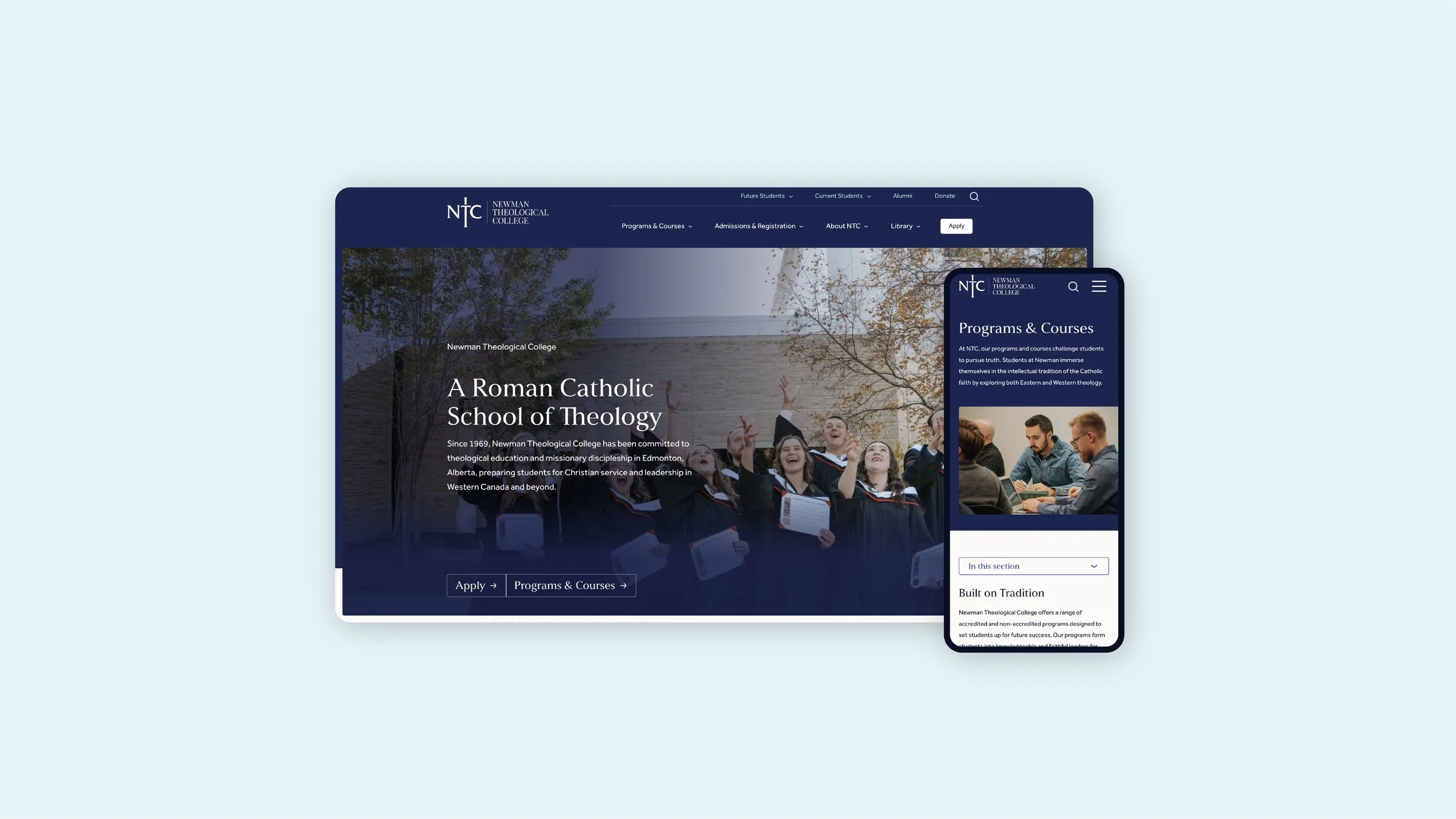
Newman Theological College
Website Design / Content Structure
Designed as part of Sonder Creative
Newman Theological College is a Catholic school of theology in Edmonton offering a selection of undergraduate and graduate programs. Their new website makes their programs and offerings easier to navigate for both prospective and current students, and keeps alumni connected.
The website design built on the existing Newman brand. Using their logo and colours, I brought new typography and design elements to create a fresh approach while still staying true to a traditional look and feel that connects with their student base.
As part of designing the website, I assisted in re-structuring the site map, navigation, and overall content structure. The previous website was difficult to navigate since it was hard to tell where to look for different content types. The new website provides both a content-based and an audience-based approach to the navigation, making it easier for users to self-identify what they need.
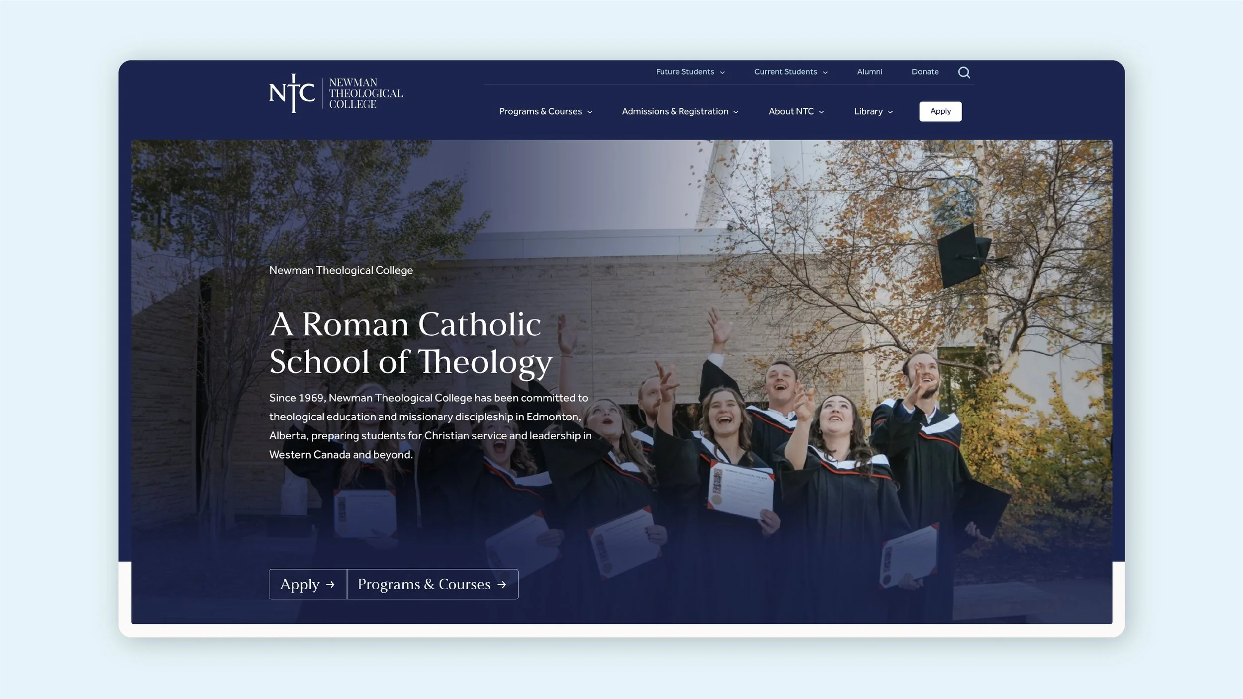
Above the fold, the website builds trust by introducing the history of Newman and their mission. The main calls to action to Apply and view Programs & Courses are emphasized in stylized buttons. These buttons are also flexible and can be changed to different CTAs; for example, the buttons can change to feature Graduation Requirements at certain times of year.
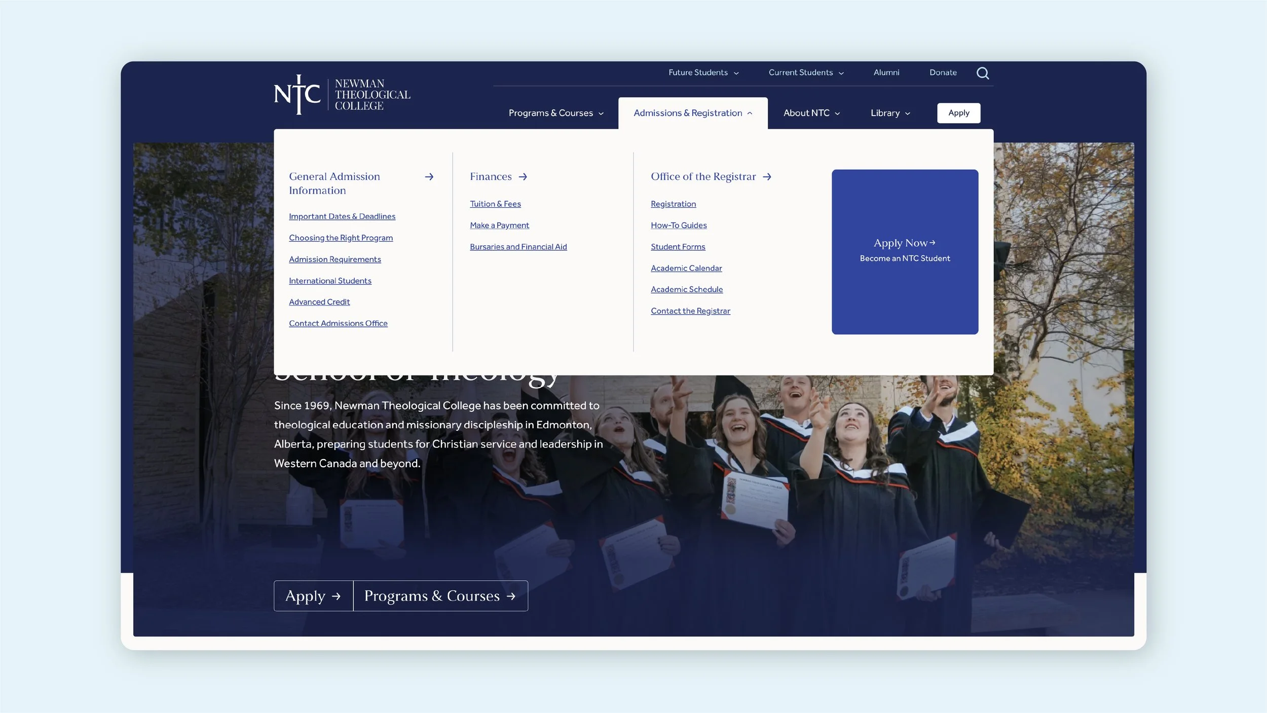
Mega menus are used to display a large number of pages in an organized way. This makes it easier for users to find the page they’re looking for, rather than sifting through sub menus. Even so, the pages are organized into intuitive sections, with certain pages pulled out as a feature block.
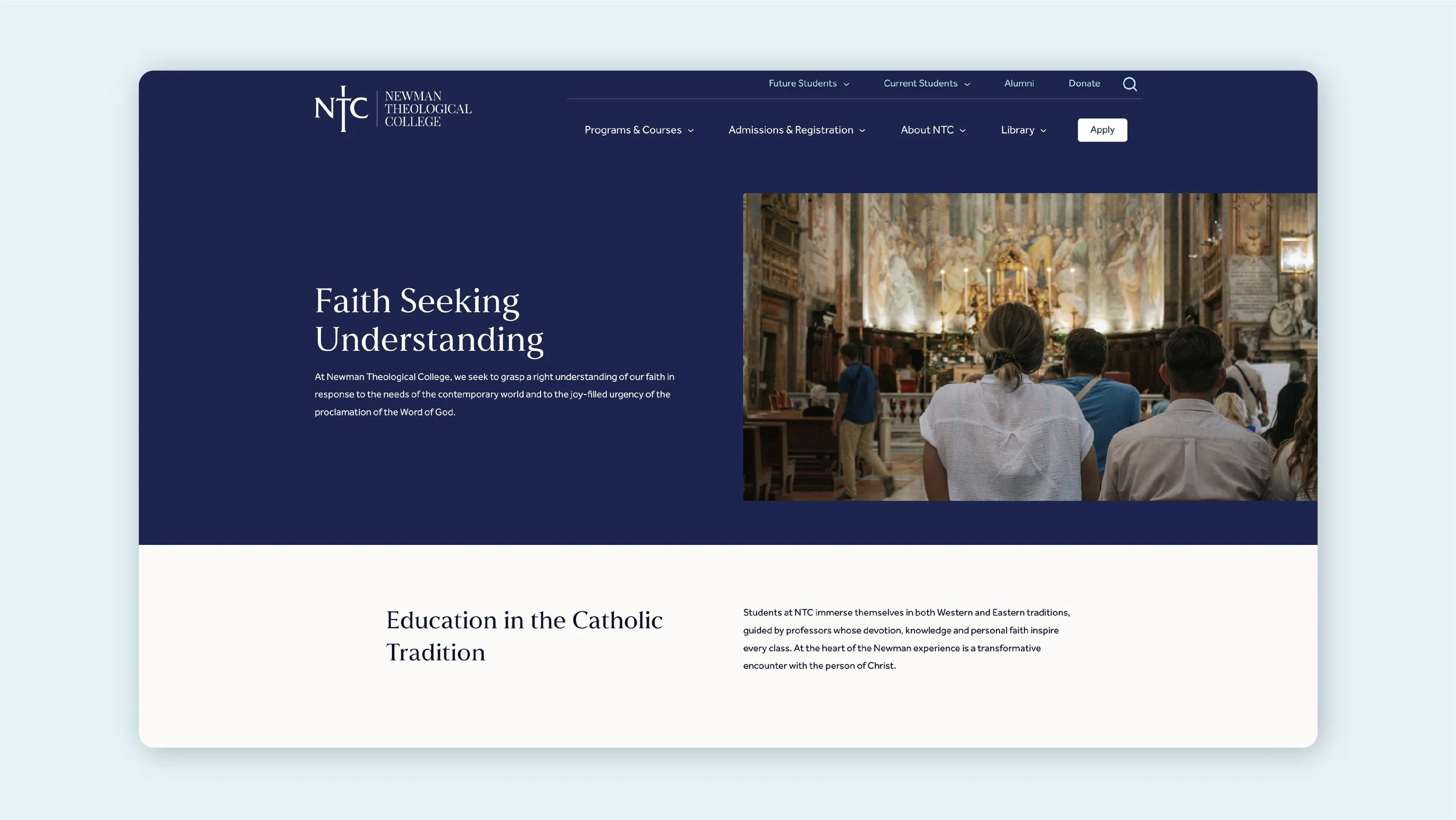
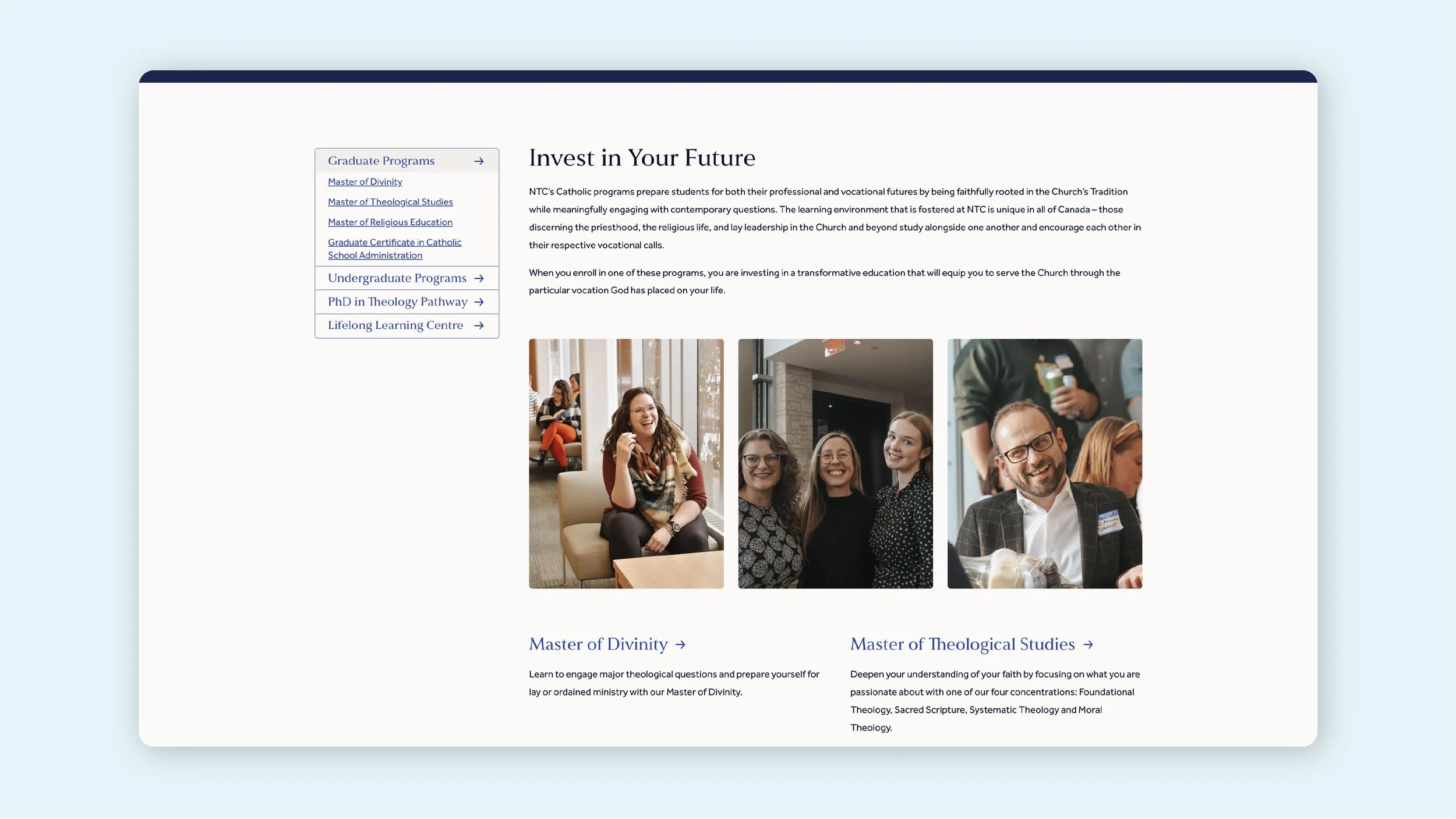
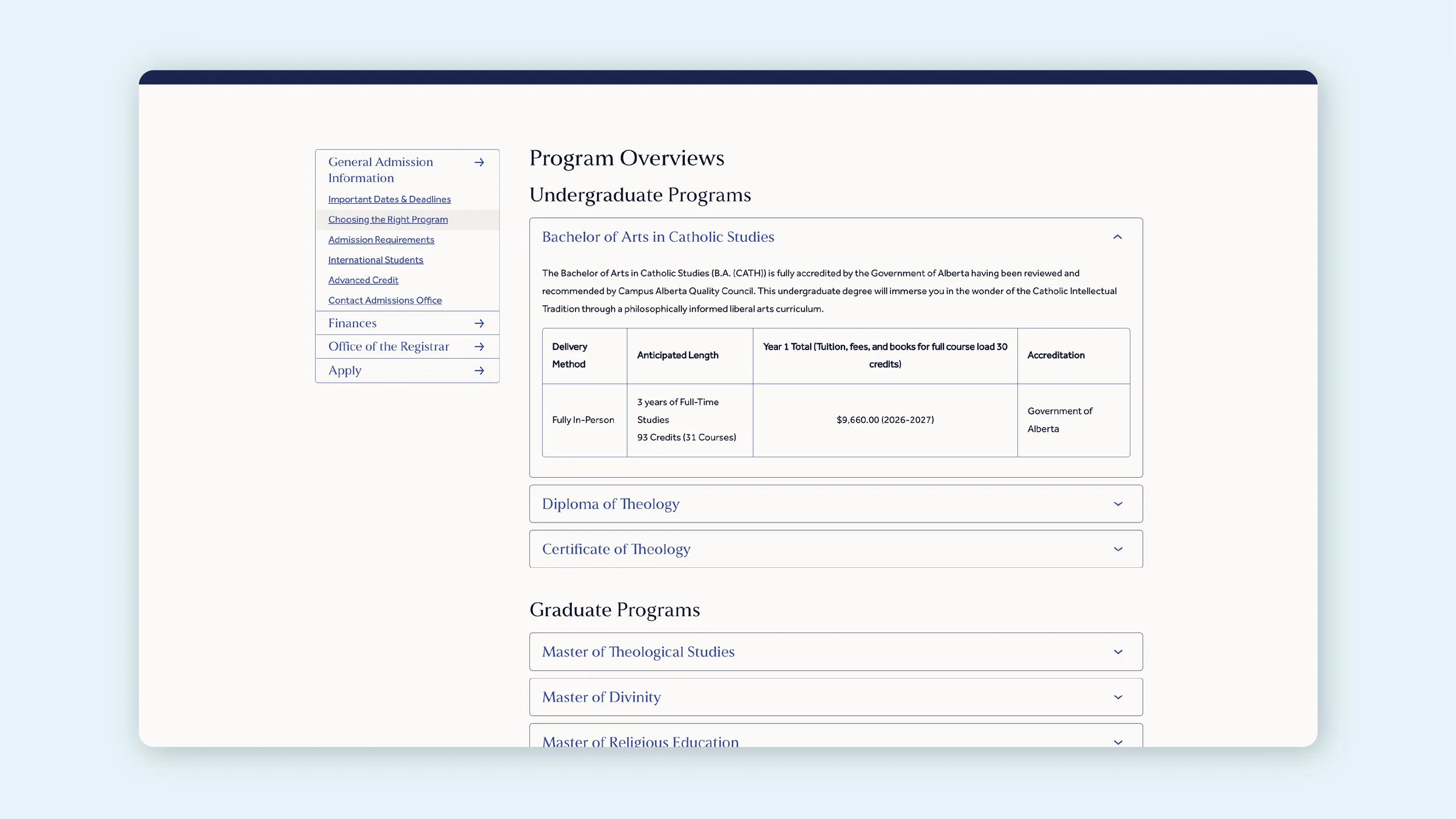
Within the site, side menus are used in more complex sections to make navigating easy, especially in sections where users may browse many pages while learning about courses or application processes. These menus are sticky and stay with the user as they scroll down the page. To make sure the content stays an appropriate length on the side, only the sub-pages for the current section are visible.
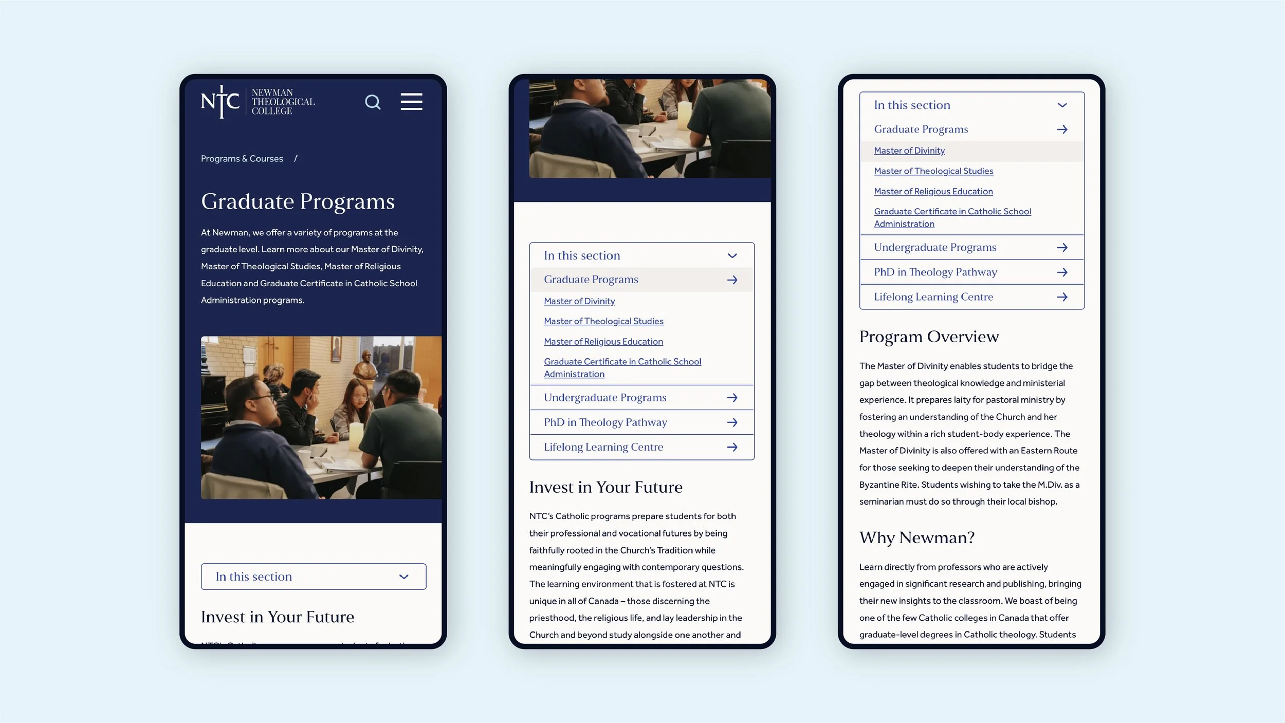
The side menus are responsively adapted to drop down menus on smaller screen sizes to make the website easy to use on all devices. These are at the top of each relevant page.
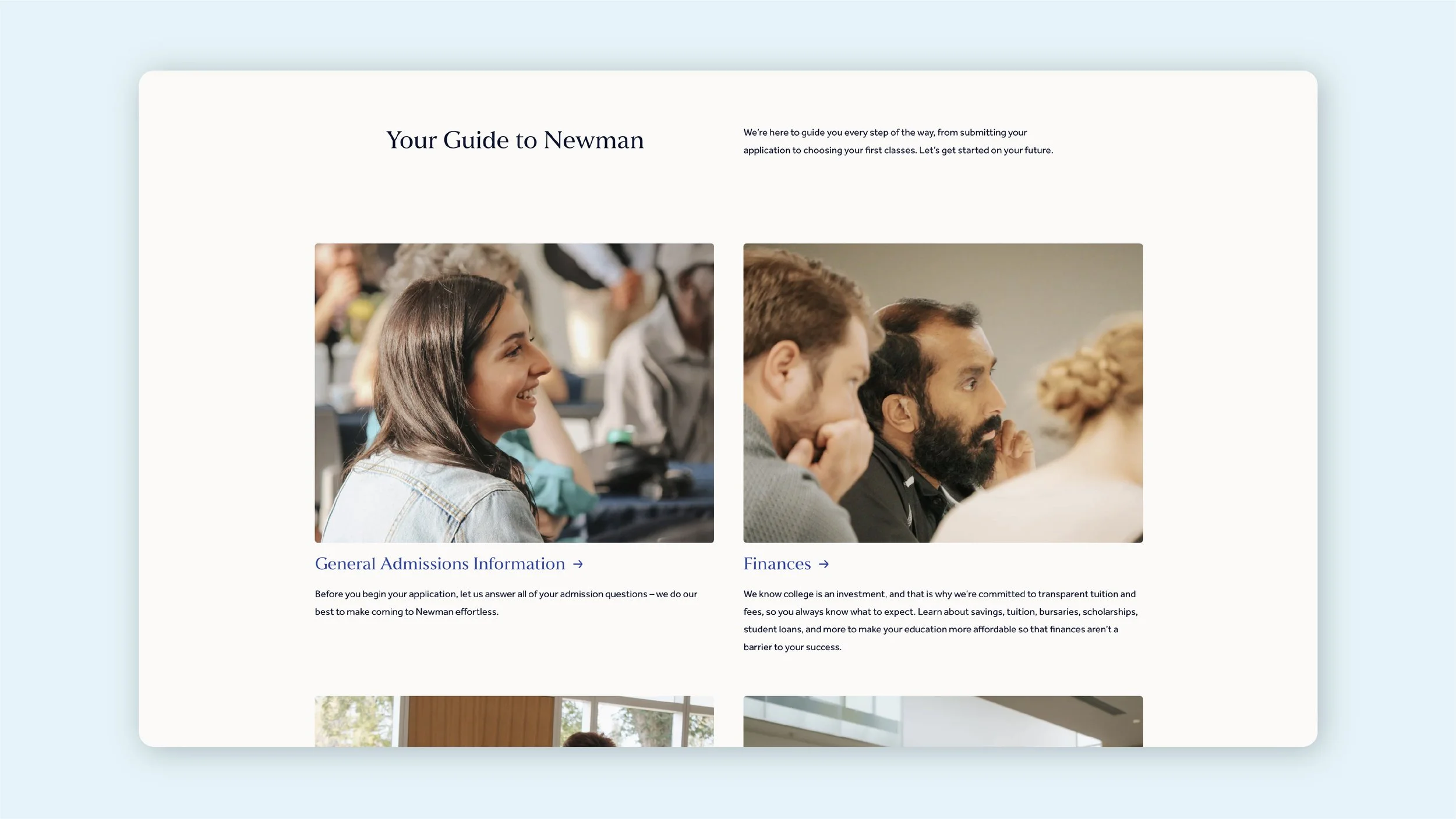
One of the challenges of their original website was having an overwhelming amount of information on each page. The new website splits up information into relevant groups to make it easy for users to target the specific items they’re looking for. On pages where a larger amount of content is necessary, strategies like accordion folders are used to further split the information up to make it easier for users to skim to find the sections most relevant to them.
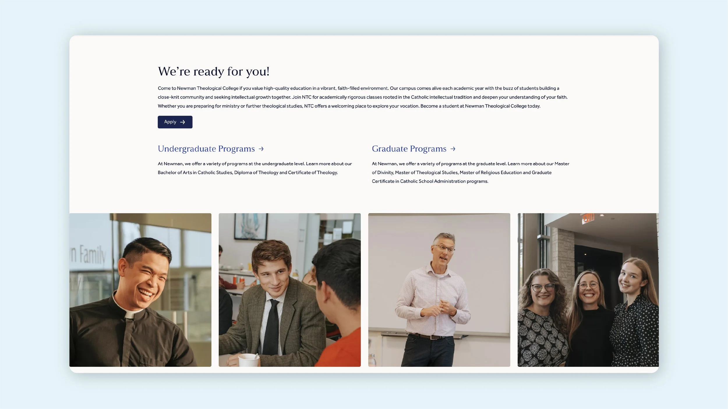
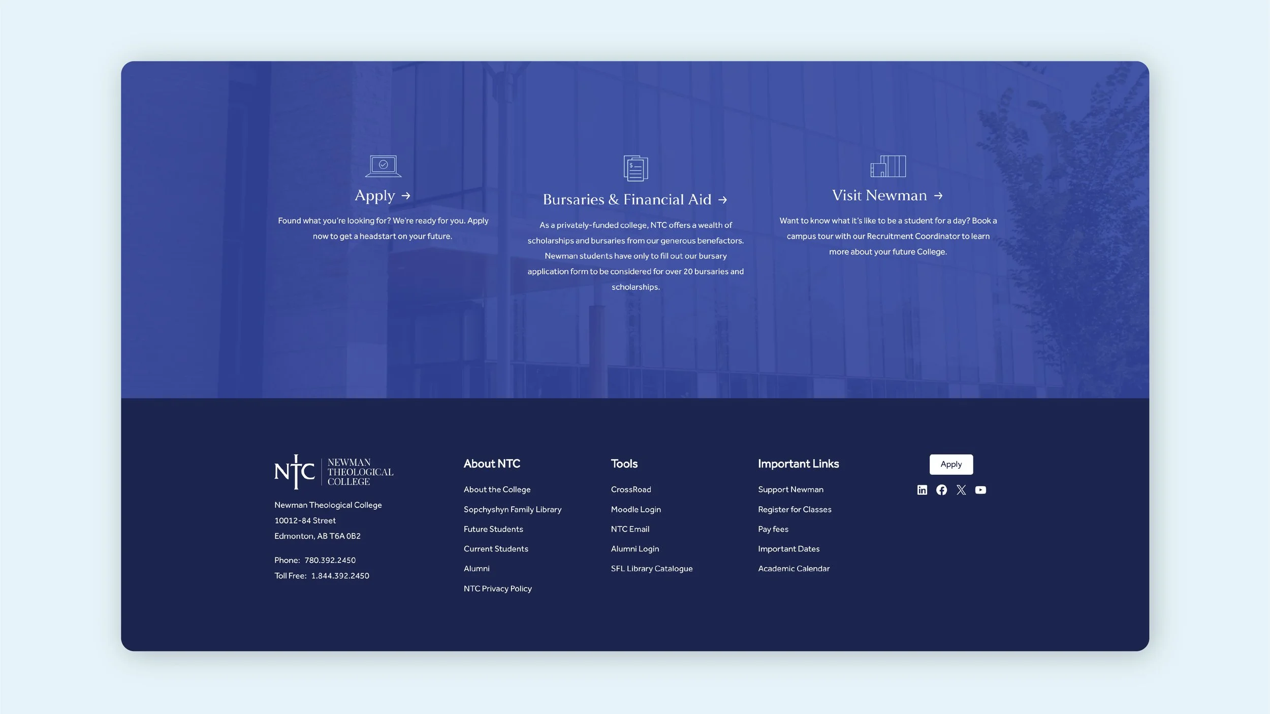
Towards the bottom of each page, I created custom icons to accompany buttons to a few main actions that users look for. The footer was curated to show a selection of links that are most commonly used as a catch-all for users who may not have browsed the website extensively.
The overall tone of the website is encouraging and helpful, while maintaining a professional and traditional look that reflects Newman’s values. The new website successfully makes it easier for future, current, and past students to navigate and find their space in the Newman community.